The Concept Behind The Sentry Identity
Published: 13 Sep 2023
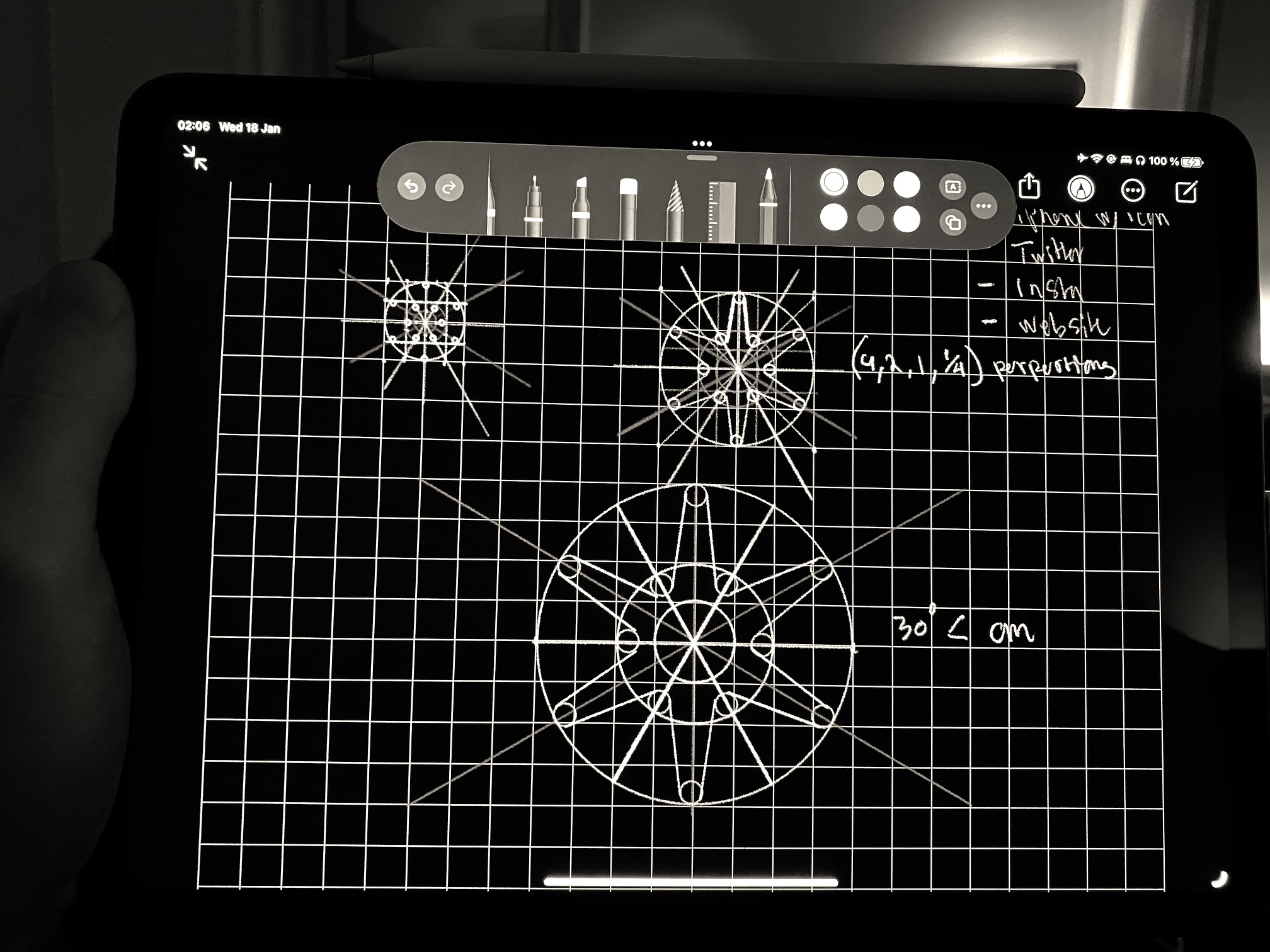
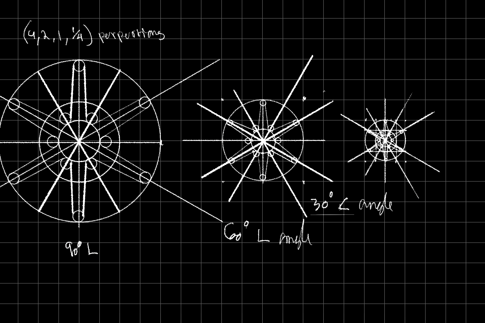
Early sketches and thoughts around the sentry identity design
As we designed the sentry mark, we merged various concepts to come up with the final idea. The aim was to create a design that would symbolize security and passwords. We chose to use an asterisk since it is commonly associated with passwords. In addition, we wanted the design to be somewhat abstract, so that it could have different meanings for different people. To achieve this, we incorporated nodes that were arranged in a way that suggested interconnectivity. This was inspired by the distributed network systems, which is one of the unique features of our application.
The concept
The goal was to create an aesthetically pleasing, symmetrical asterisk suitable for use as a website or app icon, using principles found in sacred geometry.
The design
We want the mark to be legible at different sizes on both printed documents and websites. The logo bellow is slighly thinner than the first picture (it uses the inner cirle). We might revert to the thicker version (which use the outer circle) as it is a bit more legible.
Final note
“Creativity is just connecting things” - Steve jobs. When you ask creative people how they did something, they feel a little guilty because they didn’t really do it, they just saw something. It seemed obvious to them after a while. That’s because they were able to connect experiences they’ve had and synthesize new things.


Backed by Antler and Innovation Norway
All rights reserved • Copyright © 2023 • Sentry AS • Organisation number: 925 337 625
All rights reserved • Copyright © 2023 • Sentry AS • Organisation number: 925 337 625